MedBuddy


The Product:
Medication tracker targeted for young adults but accessible to people of all ages
Project duration: 5/22- 6/22
The Problem | The Goal
Young adults on the go can lose track of their medication times & dosage amount, especially when traveling across different time zones. This app tracks not just medication times, but dosage amounts as well as the capacity to communicate with doctors & order refills.
User Research
An unmoderated usability study was conducted to determine how easy the app is to use & whether the designated users found its features to be useful. The sample user group was crucial in getting a sense of what someone with these particular medical needs would need out of this app to make it a fixture in their day to day life flow.
An Affinity Diagram was utilized to help consolidate some user issues & pain points


User Research
User comments & pain points were consolidated into sample personas to protect the identities of the participants.
A user journey map was created to gather opinions from a target user on the app’s capacity to become a useful medical assistant.
Usability Study Findings
-
App must maintain user privacy as this will involve personal medical information.
-
Daily use will maximize this app. App must feel more like an assistant than an app, as this will encourage everyday usage.
-
App is targeted for young adults but should have the capacity to be used by all. Intuitive navigation is crucial


Starting the Design
-
Trying find a balance between having a separate designated function for each section while making the app/site feel uniform was an obstacle. I eventually settled on the idea that using a theme of colors & shapes will help to tie it all together.
Recurring shapes are established from the beginning & alerts & notifications will greet the user first & foremost. Alerts will be customizable to fit the user’s needs.
-
User medical needs will vary, the options for the user to be able to easily adapt the app to fit their own requirements will be crucial to the app’s success.


Refining The Design
-
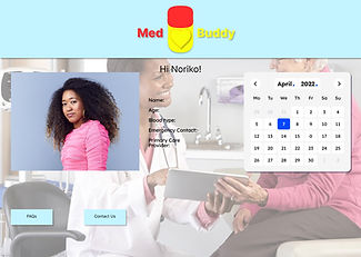
The photo background was removed from the mobile version to reduce clutter
-
Calendar can be customized to accommodate anything from doctor appointments to medication refill alerts
-
Fitness health tracker was also added, the app can then by synced with smart watches & other devices, including those of friends & family
Usability Study Findings
-
Questions received about the ability to enter lesser known medication that may not be in the default database, customization options must be maintained across the board
After usability testing, drop down features were added for the main page notification/alert boxes to make room for any notes the user may want to add. Clicking the arrow will expand the desired box as needed.
-
Direct positive feedback received for the calendar feature as easy management appoints & prescriptions will be the only way to maintain accurate alerts
-
Pop up overlays will now used to keep a straightforward user flow


Takeaways
-
Accessibility considerations drove the decision to contrast colors items in the background & foreground, as well vibrating & emergency alert features that will utilize sound
-
After usability testing, drop down features were added for the main page notification/alert boxes to make room for any notes the user may want to add. Clicking the arrow will expand the desired box as needed.
-
An app built to cater to very specific user needs that may vary from user to user can still have some commonality applied to it. For instance even though people’s medication requirements may vary, the capacity to refill medication & set alerts can be used by all.
347-232-5165
